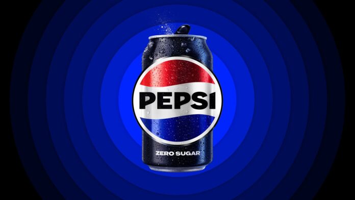
With a new logo and visual identity that fuses traditional aspects of designs from the past with contemporary accents, Pepsi is getting its first redesign since 2008.
The classic Pepsi globe and wordmark are once again joined in the new design, which pays homage to trademarks from the 1970s and 1980s by placing the wordmark inside the iconic globe once more. With simple lines and contemporary, unique typography, the revamp modernizes the retro appearance.
Electric blue and black are used in the update’s color scheme “to offer contrast, vitality, and a modern edge,” the business claimed in a news release.


