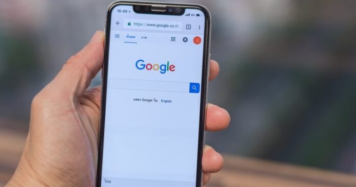
Google Search is redesigning on mobile to give a fresh look to it and to make it much easy for its users to just find what they are searching for and what information they want.
The search giant also shared their development through a post of their blog with some of the insights from designer who had led the whole visual redesign. This upcoming redesigned Google Search on mobile will also allow the people to focus just on the main information and to make text more easy for them to read, and also to have an edge-to-edge quality design as the deeper use of attractive colours along with a feel of “bubblier and more bouncier.”
Rethinking for the visual design of something like a Search is really very complex. That is especially true for like how much has evolved in Google Search. We are not just organizing the website’s information; however, the other entire overall world’s information is going to get organized, as per Aileen Cheng, the Google designer who has led the visual redesign of Google Search on the mobiles. The redesign is coming soon within few days.
The five main aspects are discussed here for the redesign including the bringing up of information into the user’s focus, making the text visible and easier to read, using the colour to just highlight the important points, and creating more of a breathing room along with a leaning room with “Googley” feelings.
This Google Search new redesign will also allow the users to more focus on information instead of other design elements that are around it which will make the searching more clearly visible in front and quick. The text will also be larger and even bolder while including the result and the section titles of being bigger. This search will surely deepen the main use of own font of Google.
It has made much easy as you can immediately check and see what you are actually searching for, this redesign will bring an edge-to-edge results by minimizing the main use of the shadows. It will also allow the search results as well as other content to be the main focus of the page. Cheng also explains that our team kept a very clean background for every image and the content; however, we use colour to bring up the focus of it towards the important information only.
Lastly, roundness of the logo of Google is also being brought to some other places while including the other images and icons.


